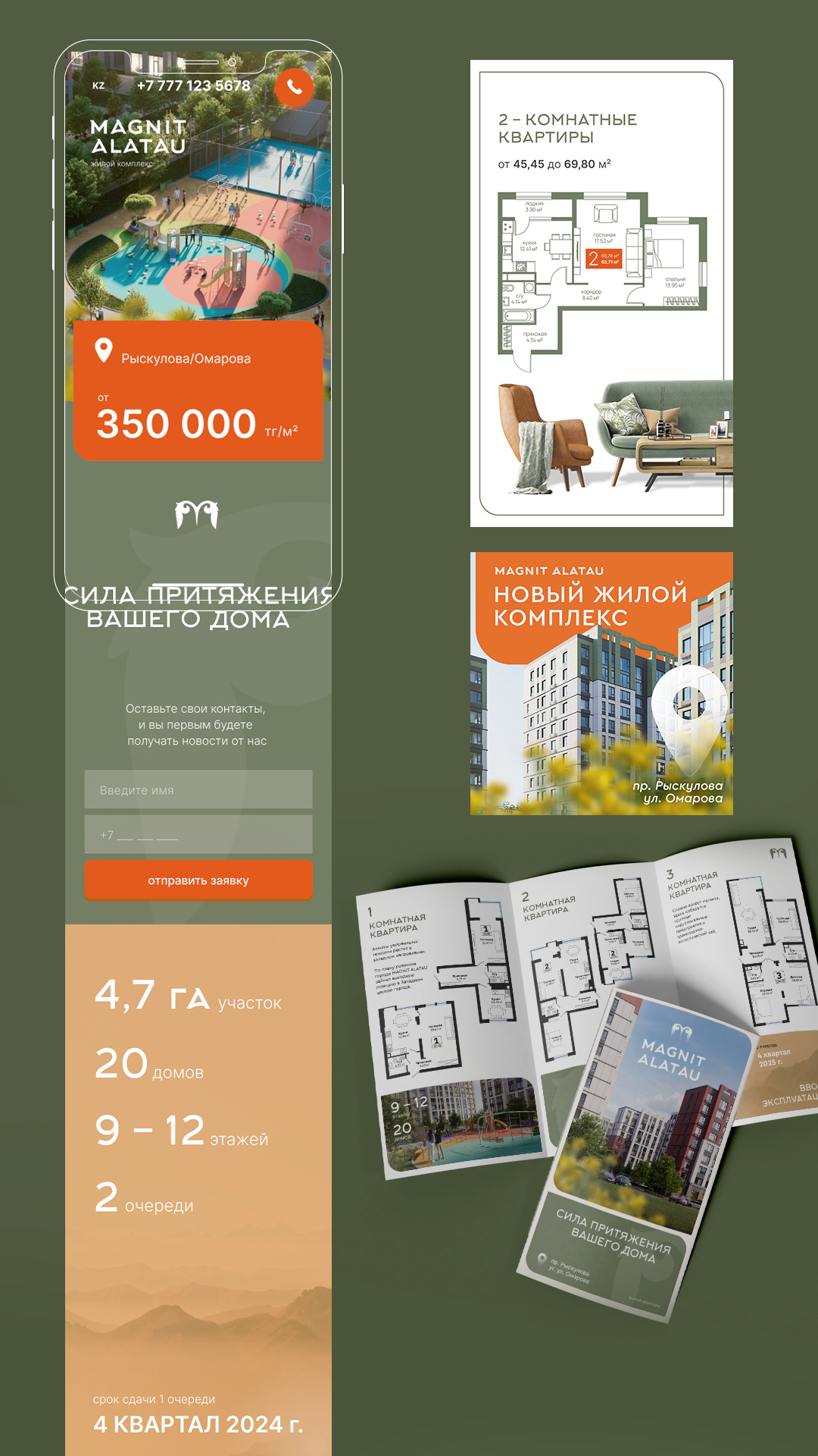

Branding for Magnit Alatau
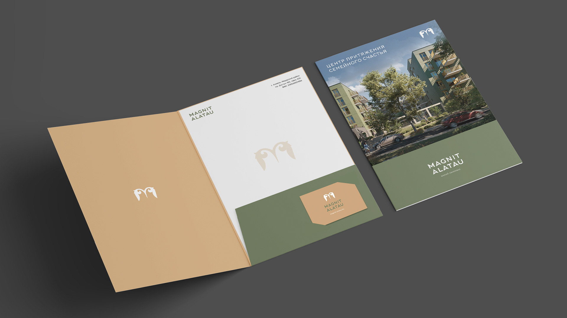
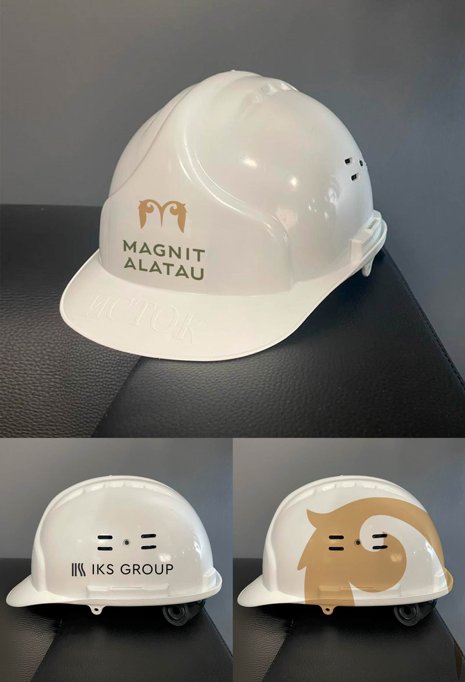
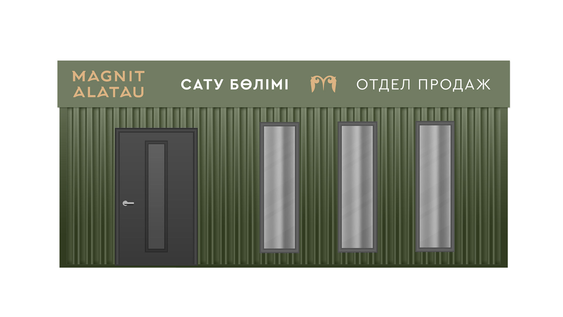
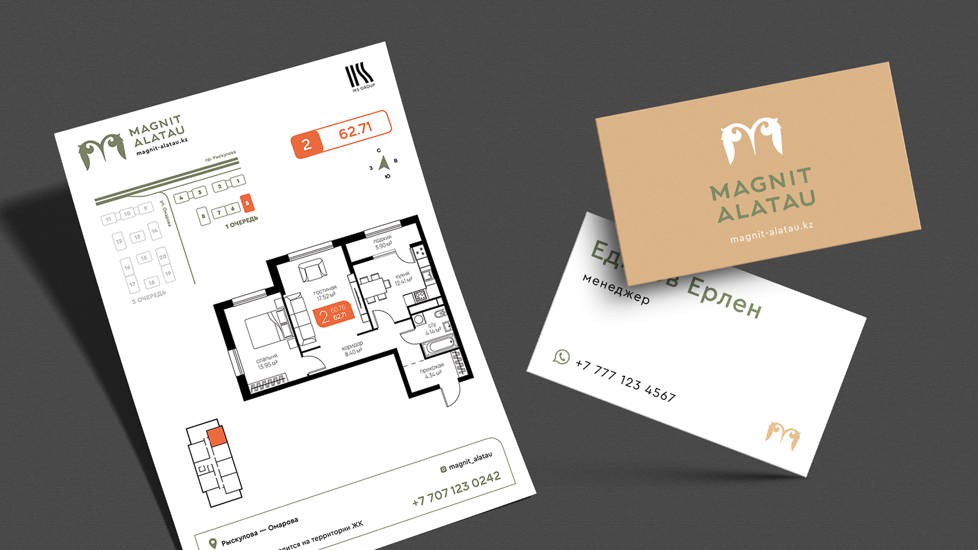
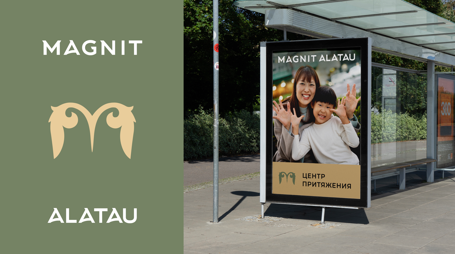
This project holds particular significance for me due to its warm atmosphere, nuanced cultural references, and carefully articulated visual language. I developed the complete branding system, including the logo, visual concept, print materials, construction site branding, and website, ensuring a cohesive identity across every touchpoint.
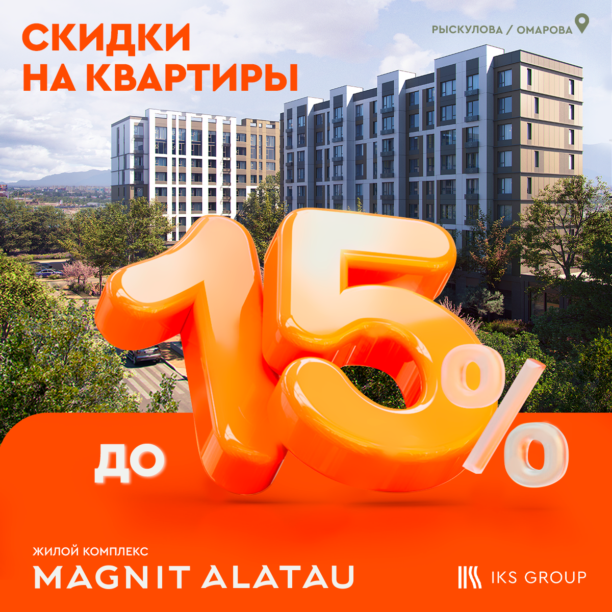
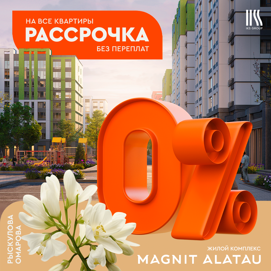
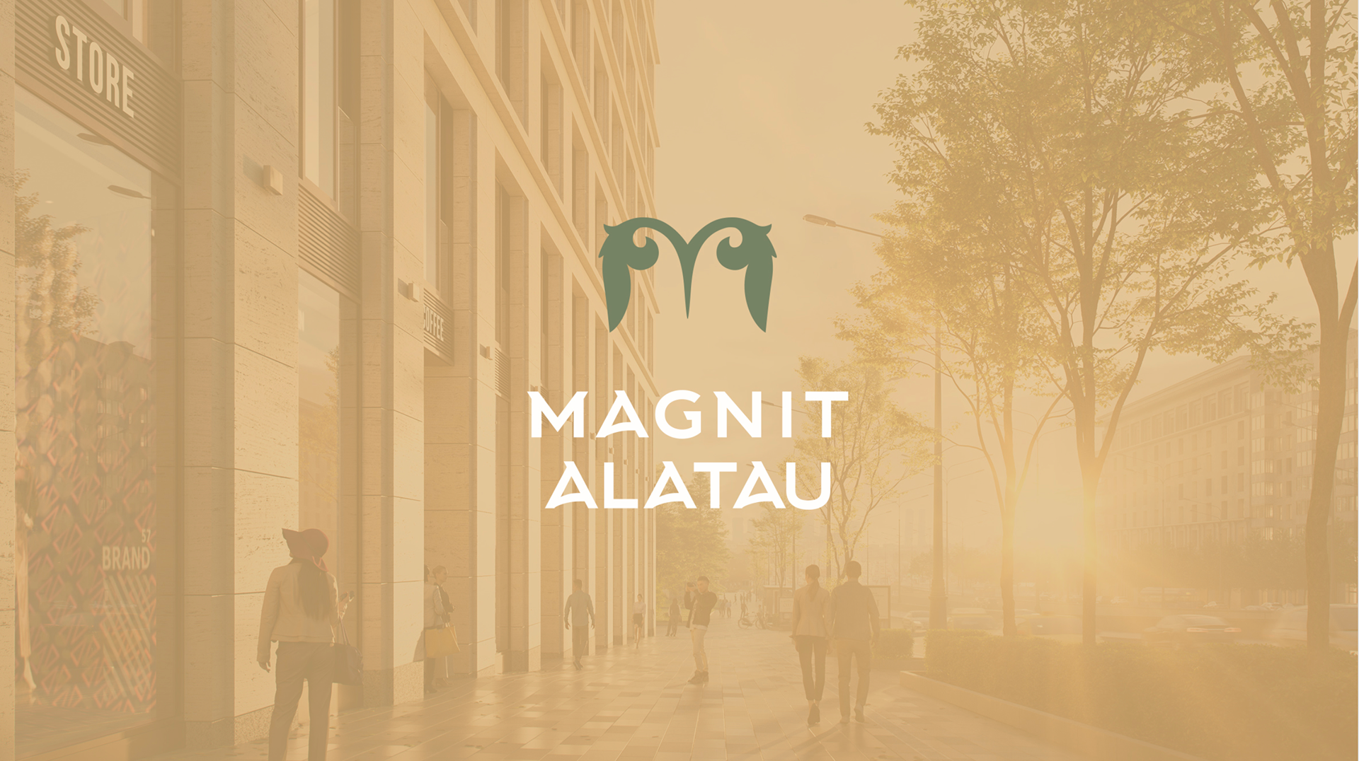
The logo draws inspiration from traditional national ornamentation, stylized to form the letter “M” while subtly referencing the Alatau Mountains, the complex’s geographical context. The color palette reflects the symbolism of early spring, green emerging from earthy tones, representing renewal and new beginnings for future residents. To strengthen campaign visibility, I introduced a bold orange accent that brought energy and distinction to marketing communications.
The result was a cohesive and strategically positioned brand that supported a successful launch, culminating in a fully sold-out complex and the formation of a vibrant residential community.