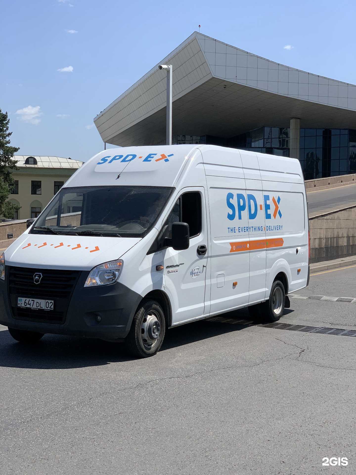
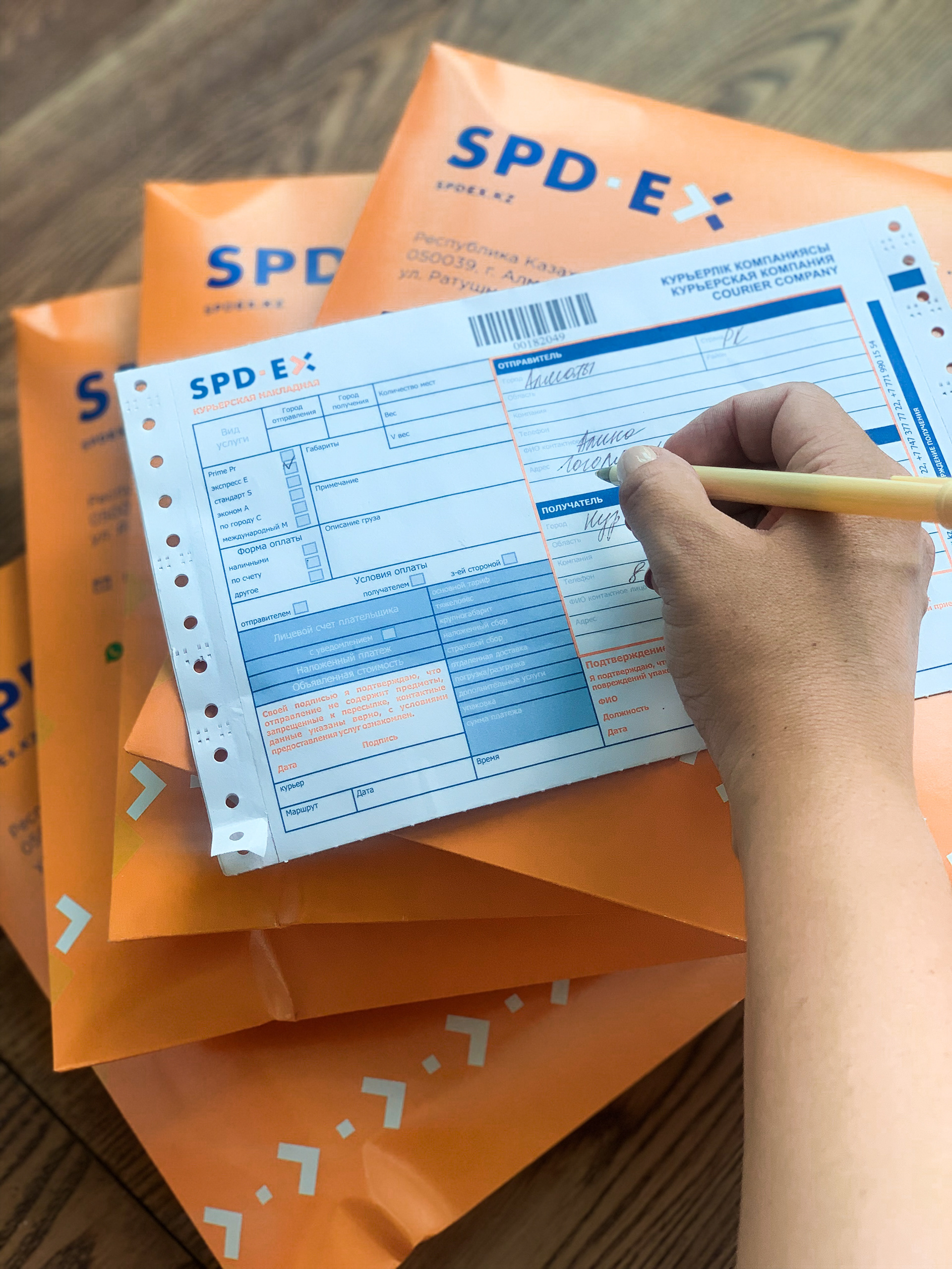
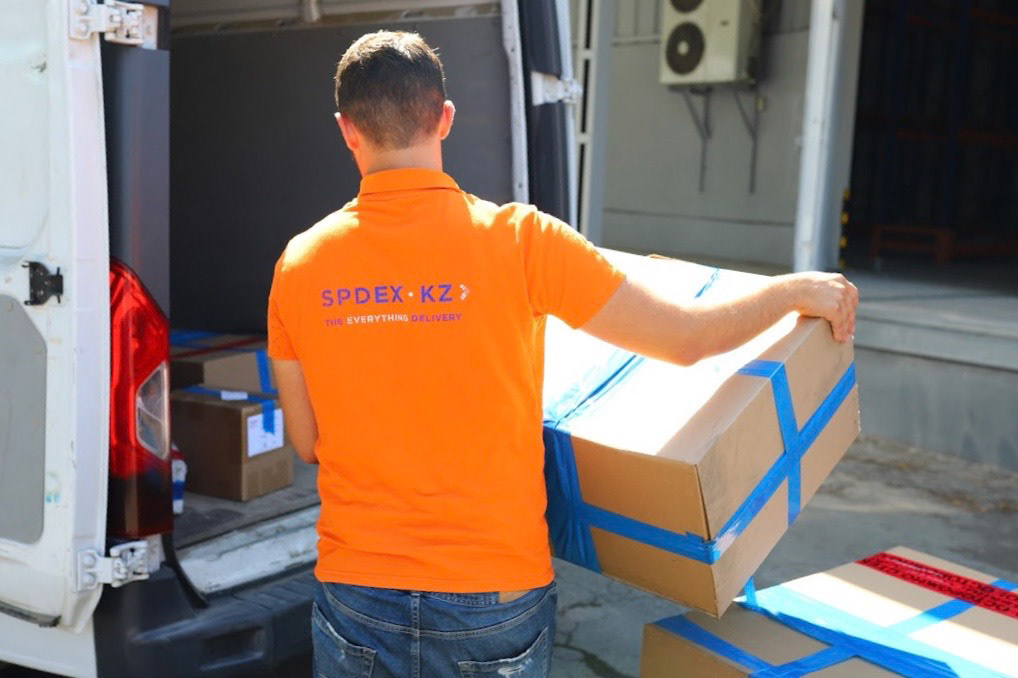
This branding project helped the company become one of the top six in its market. I redesigned their logo, created a scalable identity, and developed branding for their expansion into moving services and an educational platform.
This branding project unfolded in three key phases, each aligned with the company’s growth and evolving needs. My role extended beyond design—I worked closely with the client as a strategic partner, ensuring that the brand identity not only reflected their expertise but also positioned them for future expansion. A well-designed, cohesive identity provides a strong foundation, making future branding efforts more seamless and effective.
Phase One: Modernizing the Identity
The client, a 20-year-old delivery company with extensive logistics expertise, needed a strong, modern brand to compete with international players. The first step was redesigning their existing logo—transforming it into a sleek, simplified, and highly functional mark. The client specifically requested an arrow to be incorporated, reflecting speed and efficiency. Alongside the logo, I developed a cohesive visual identity, including patterns, illustrations, and a complete brand book. The branding extended across all print materials, ensuring consistency and clarity. By refining their identity, I helped them establish a stronger presence in the industry, making them more recognizable and competitive.


Phase Two: Expanding into Moving Services
As the company grew, they launched a moving services division, requiring a distinct yet connected brand identity. I designed a modular logo system that could seamlessly adapt to different applications, from stickers on moving boxes to digital and print media. To support this new service, I also created a series of custom-designed icons for packaging and transportation, ensuring a practical and recognizable brand presence. My approach ensured that the branding was not only visually appealing but also highly functional—easy to apply across different touchpoints and scalable for future needs.
Phase Three: Digital Start – A Platform for Young Entrepreneurs
In the final phase, the company took a philanthropic step, launching Digital Start, an educational platform aimed at mentoring young entrepreneurs. The founders envisioned this initiative as a charitable program, empowering ambitious individuals to build their own businesses. I was entrusted with developing a logo and identity that reflected innovation, mentorship, and growth. The result was a dynamic visual system that aligns with the company’s core values while inspiring the next generation of business leaders.
The Impact of a Thoughtful Identity
Through each stage of this project, I ensured that the branding remained clean, adaptable, and forward-thinking. A well-designed identity doesn’t just serve present needs—it becomes a tool for future projects, allowing the company to expand effortlessly while maintaining brand consistency. My work helped the client streamline their visual communication, build trust with their audience, and create a strong, recognizable presence in multiple industries.