

Branding for SPDex
I led the strategic rebrand of SPDex, a logistics company with over 20 years of industry experience, supporting its evolution into one of the top six companies in its market. My role extended beyond visual execution, I worked closely with leadership to build a cohesive identity system capable of sustaining long-term growth and diversification.
Phase I: Repositioning and Identity Redesign
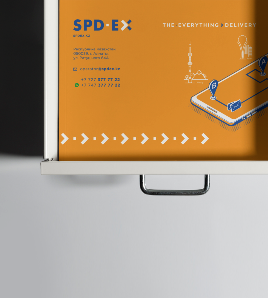
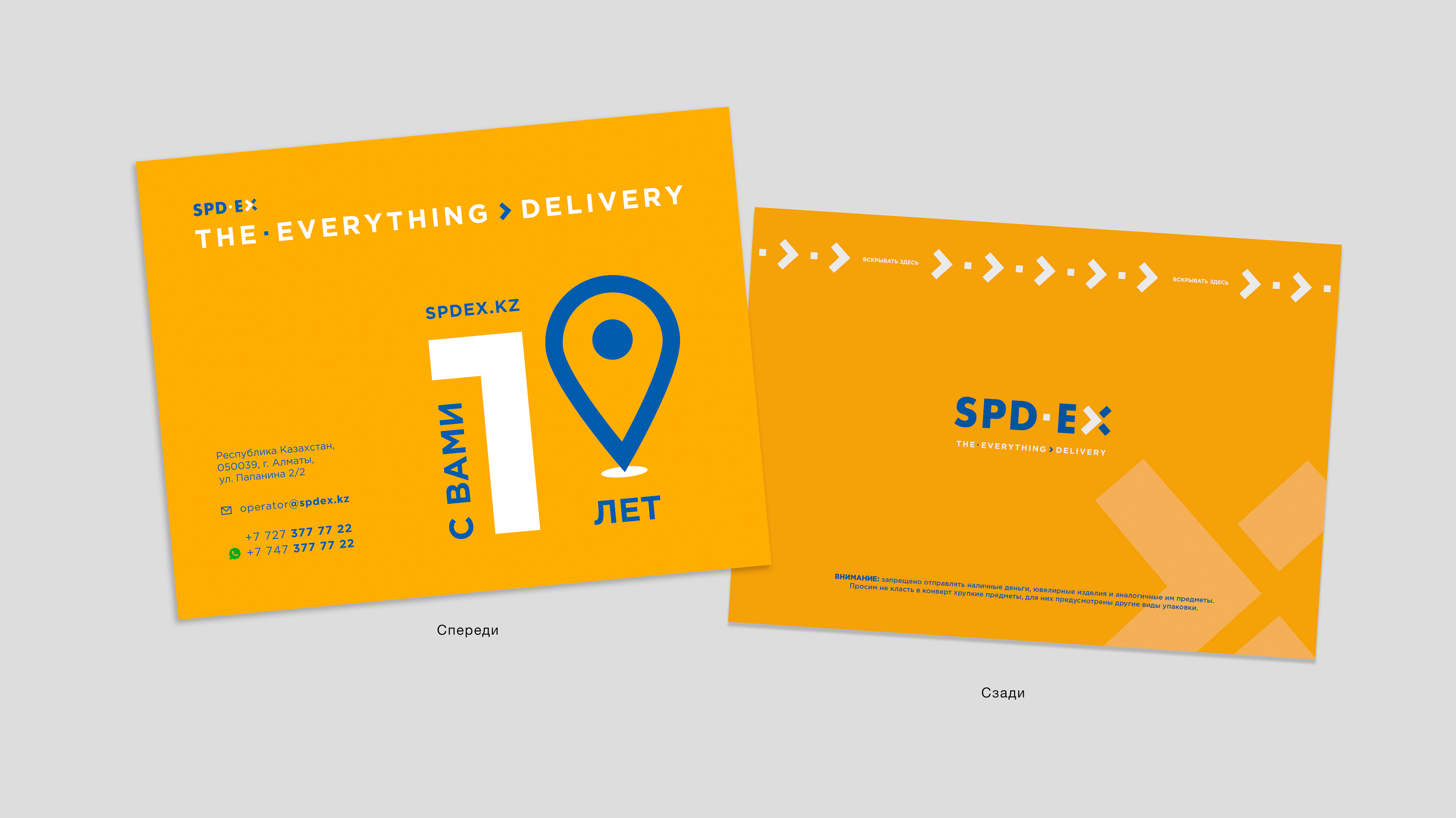
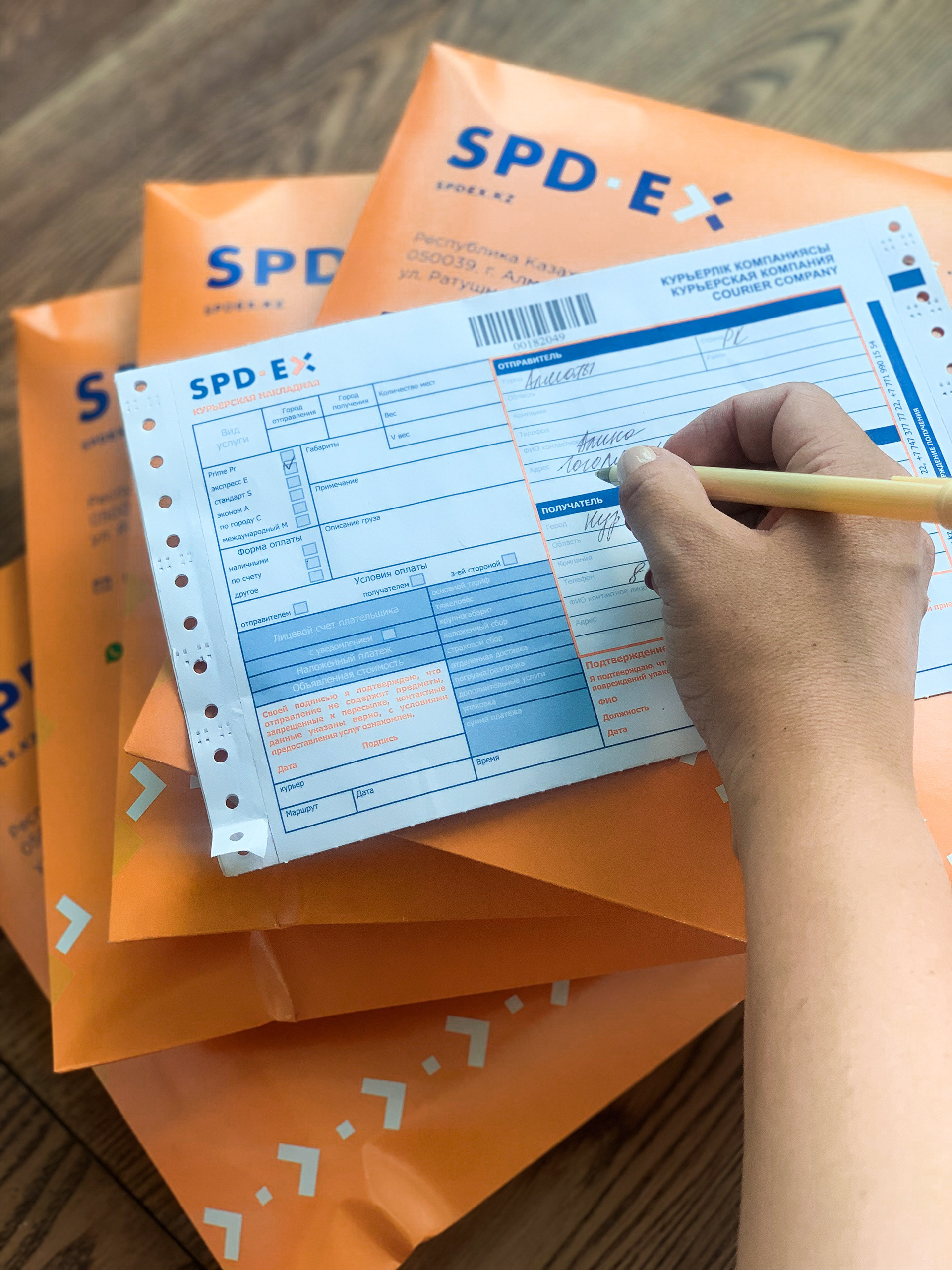
The first phase focused on modernizing the brand to compete within an increasingly international landscape. I redesigned the logo into a simplified, contemporary mark incorporating an arrow motif to communicate movement, precision, and operational efficiency. I established a scalable visual system, including custom graphic elements, illustration language, and a comprehensive brand book to ensure consistency across all touchpoints.
The first phase focused on modernizing the brand to compete within an increasingly international landscape. I redesigned the logo into a simplified, contemporary mark incorporating an arrow motif to communicate movement, precision, and operational efficiency. I established a scalable visual system, including custom graphic elements, illustration language, and a comprehensive brand book to ensure consistency across all touchpoints.
Phase II: Expansion into Moving Services
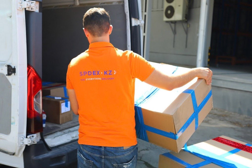
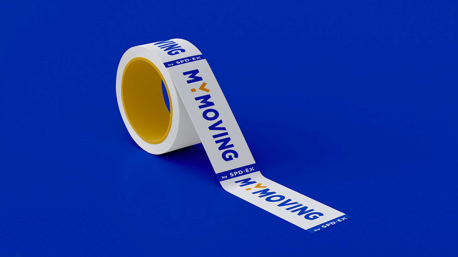
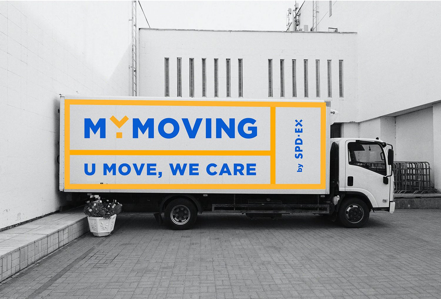
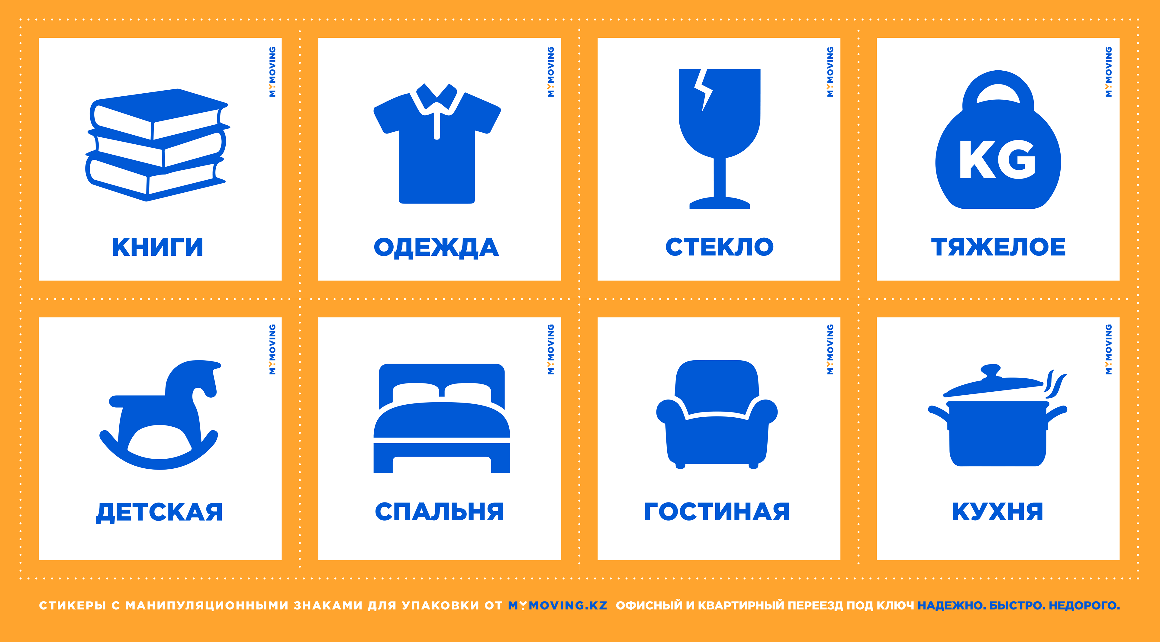
With the launch of a new moving division, I developed a modular identity architecture that allowed the core brand to expand while maintaining structural coherence. A functional icon system and adaptable logo applications were designed for packaging, transport materials, and digital platforms, prioritizing clarity, usability, and scalability.
With the launch of a new moving division, I developed a modular identity architecture that allowed the core brand to expand while maintaining structural coherence. A functional icon system and adaptable logo applications were designed for packaging, transport materials, and digital platforms, prioritizing clarity, usability, and scalability.
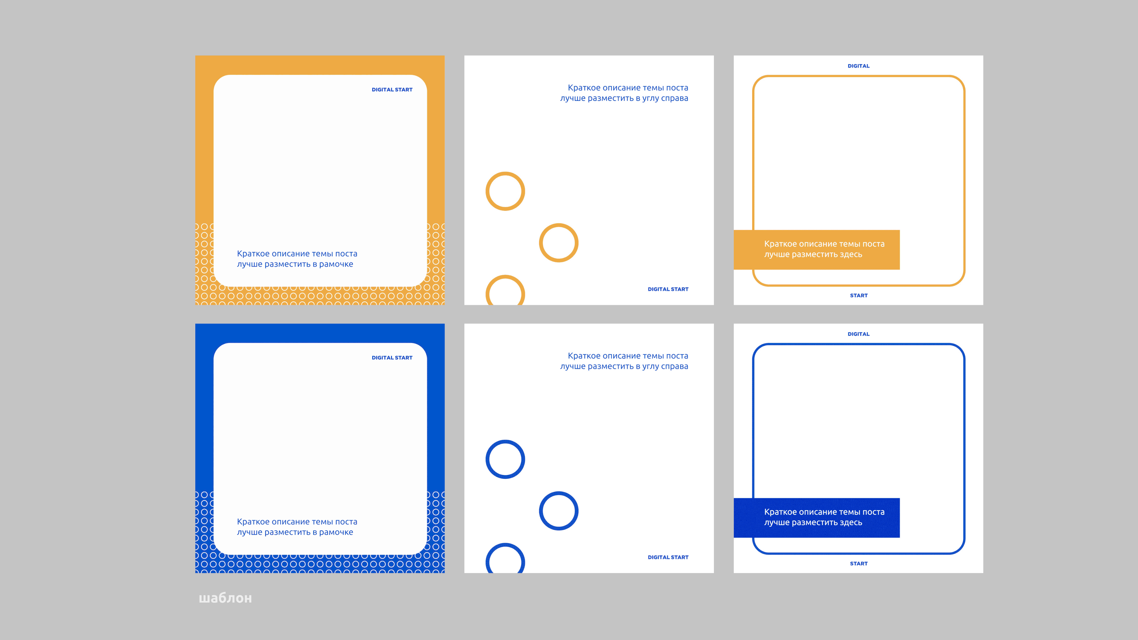
Phase III: Digital Start Educational Platform
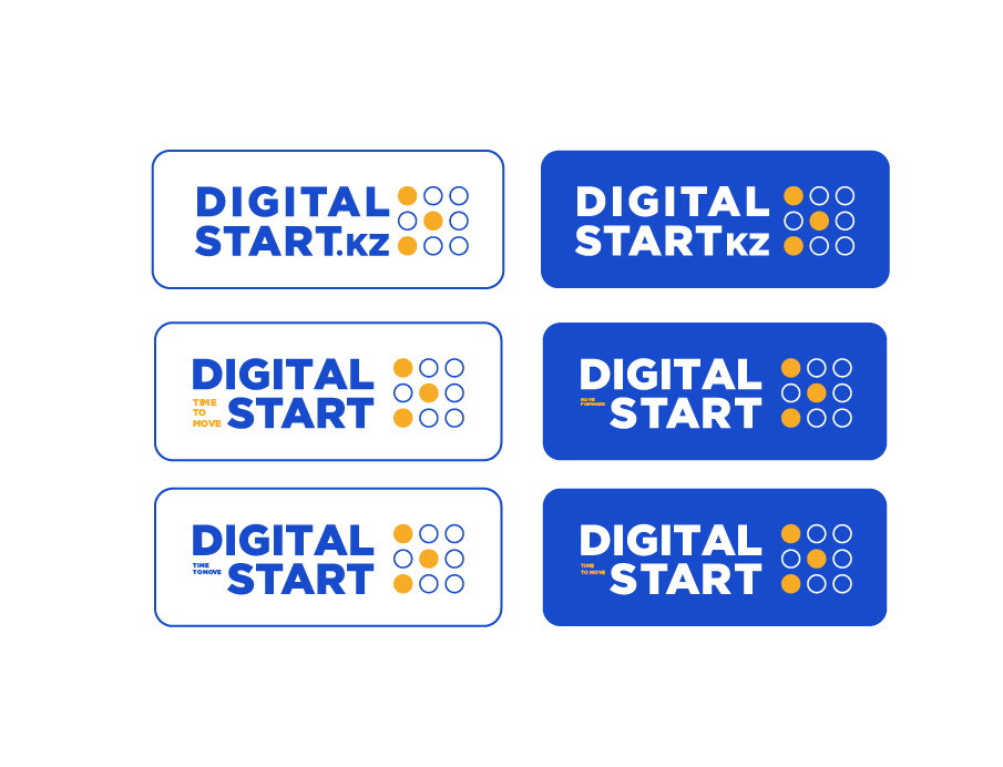
For the company’s philanthropic initiative, Digital Start, I created a distinct yet strategically aligned sub-brand. The visual language emphasizes innovation, mentorship, and growth, positioning the platform as both credible and forward-thinking while remaining connected to the parent identity.
For the company’s philanthropic initiative, Digital Start, I created a distinct yet strategically aligned sub-brand. The visual language emphasizes innovation, mentorship, and growth, positioning the platform as both credible and forward-thinking while remaining connected to the parent identity.
Across all stages, I established a disciplined and adaptable brand framework, one that supports operational clarity, cross-sector expansion, and sustained visual consistency.