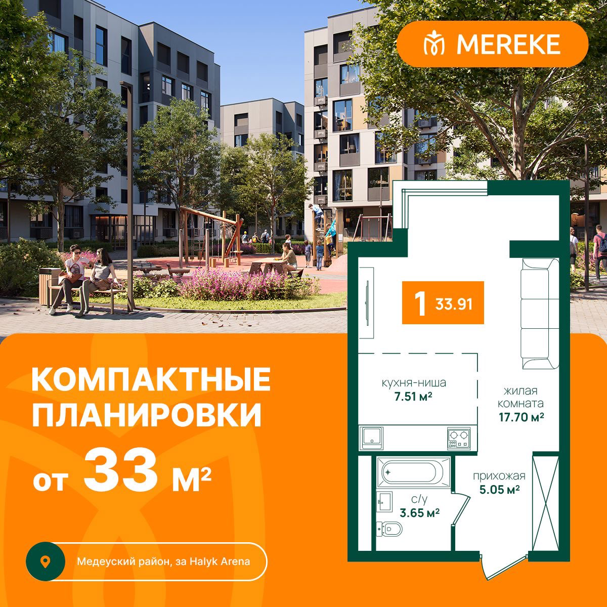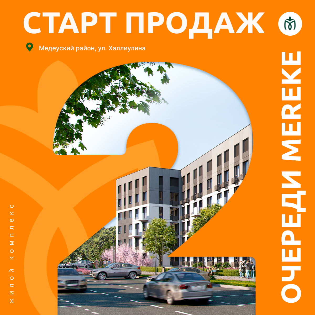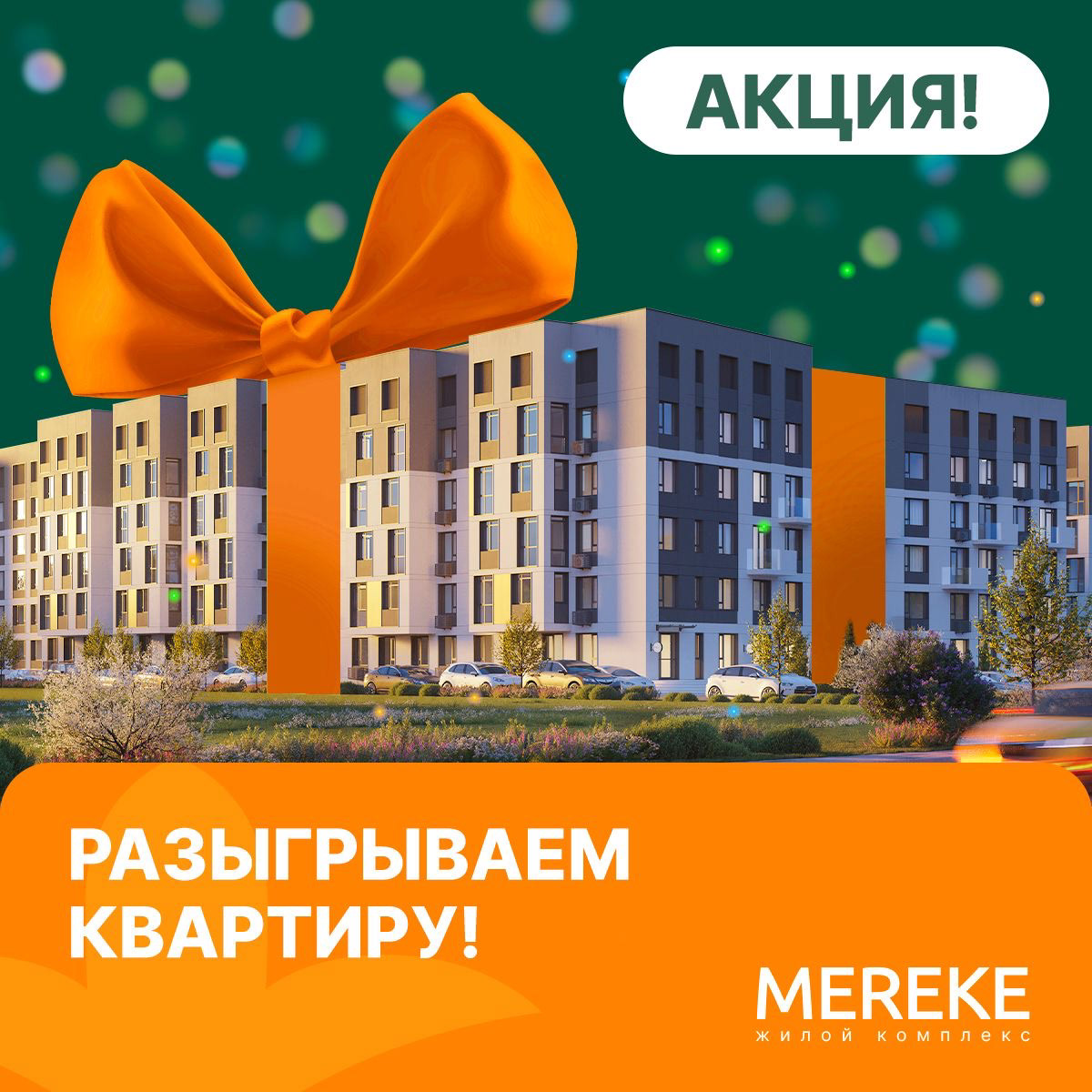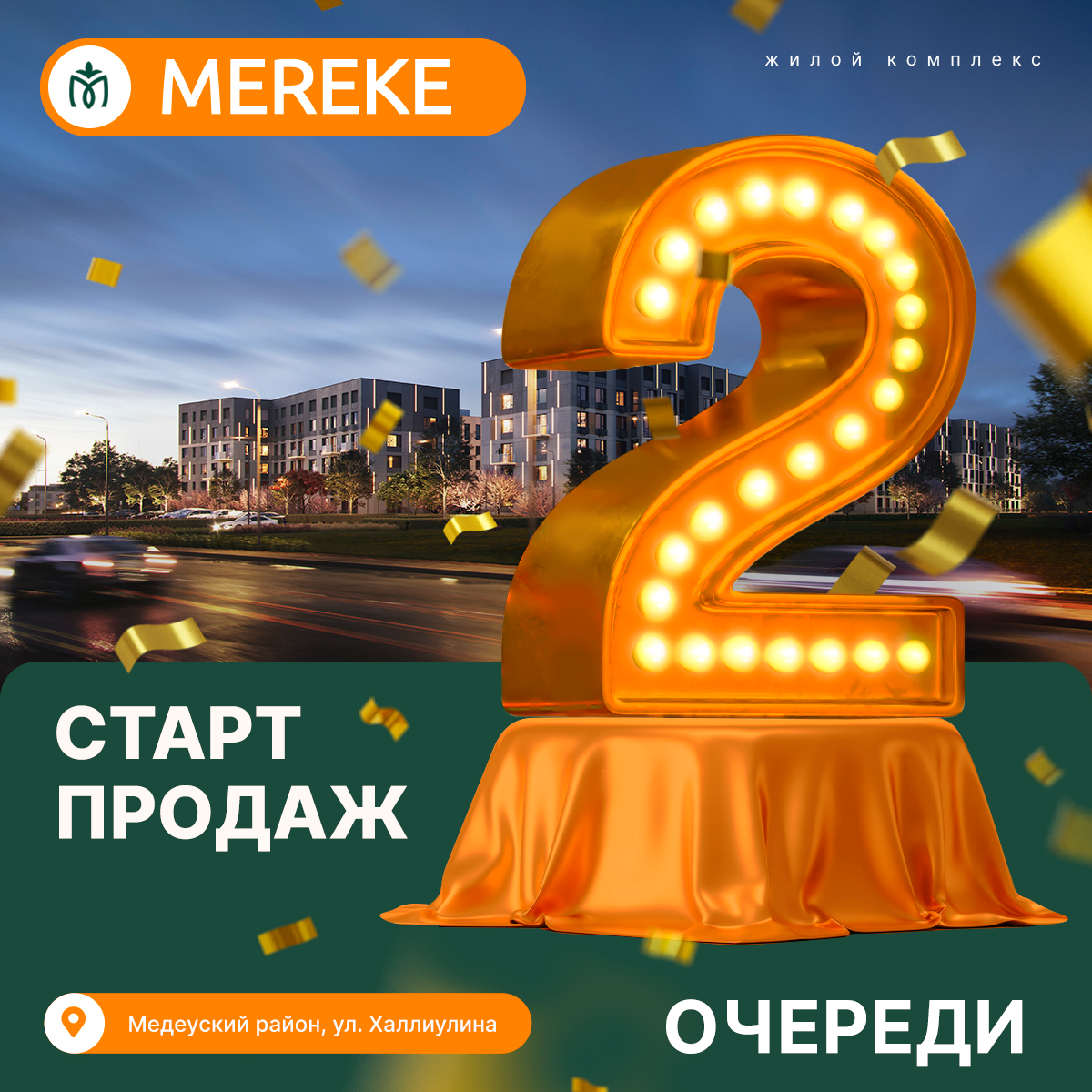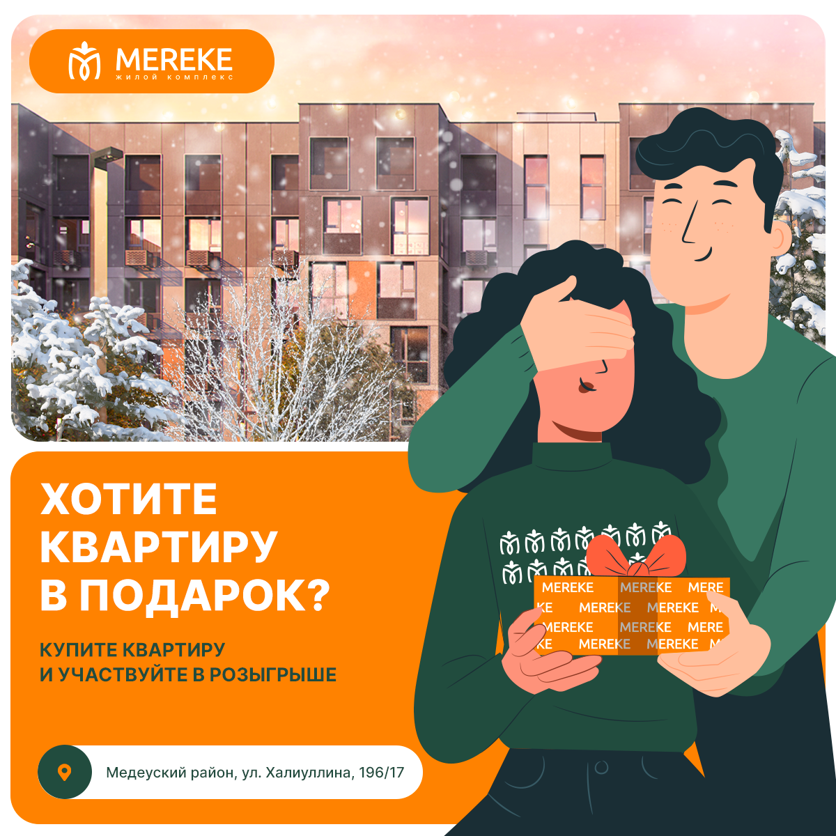

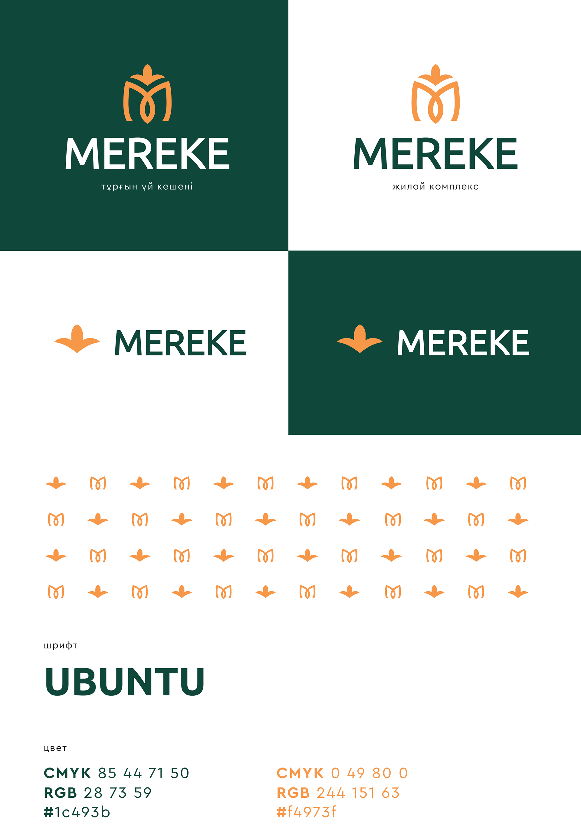
Branding for Mereke
I developed a bright and vibrant branding for ЖК Mereke, a residential complex designed to appeal to young adults seeking modern, energetic, and community-focused living. The identity uses bold colors, playful typography, and dynamic graphic elements to reflect the name “Mereke” — which translates as “celebration” — emphasizing a joyful, welcoming, and youthful atmosphere.
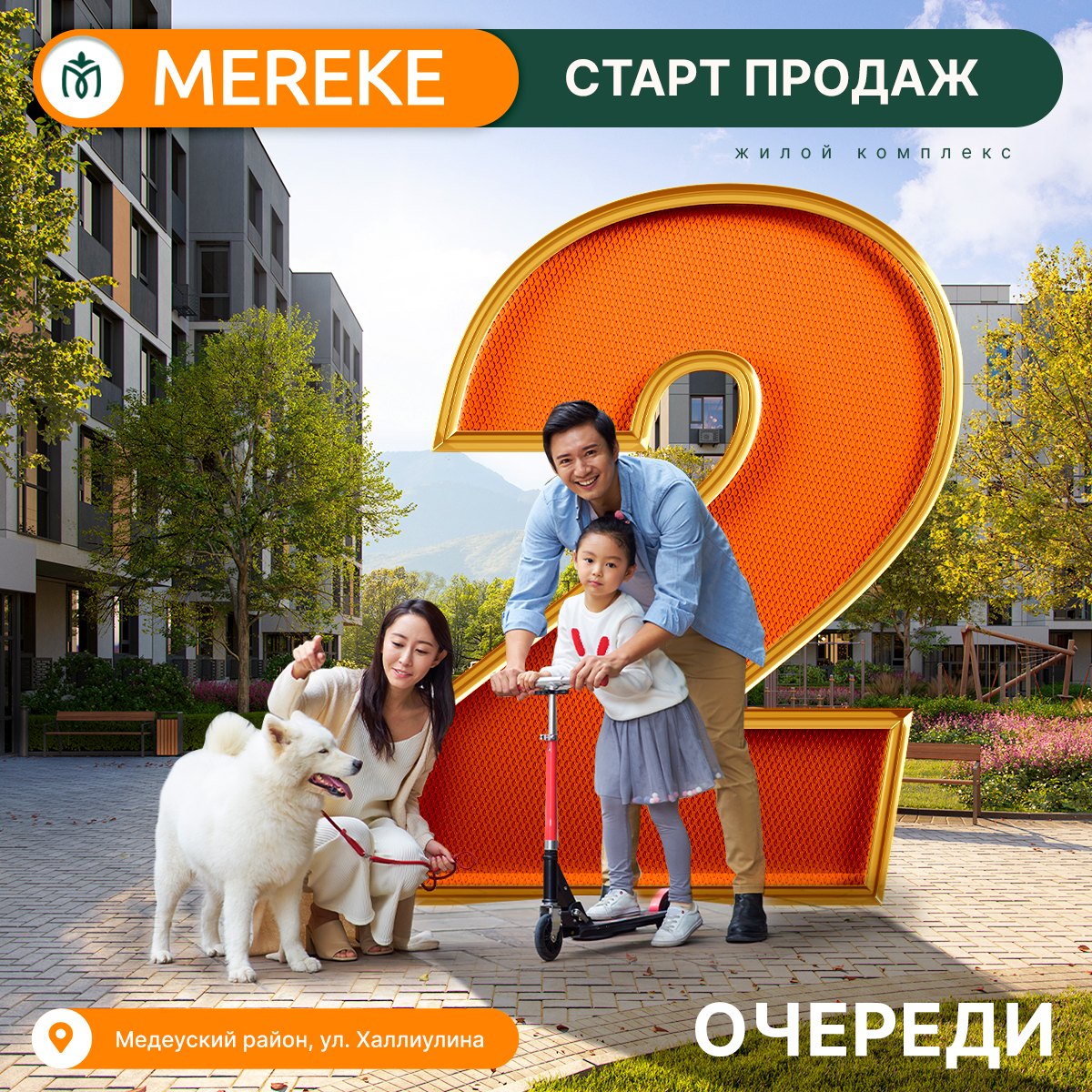
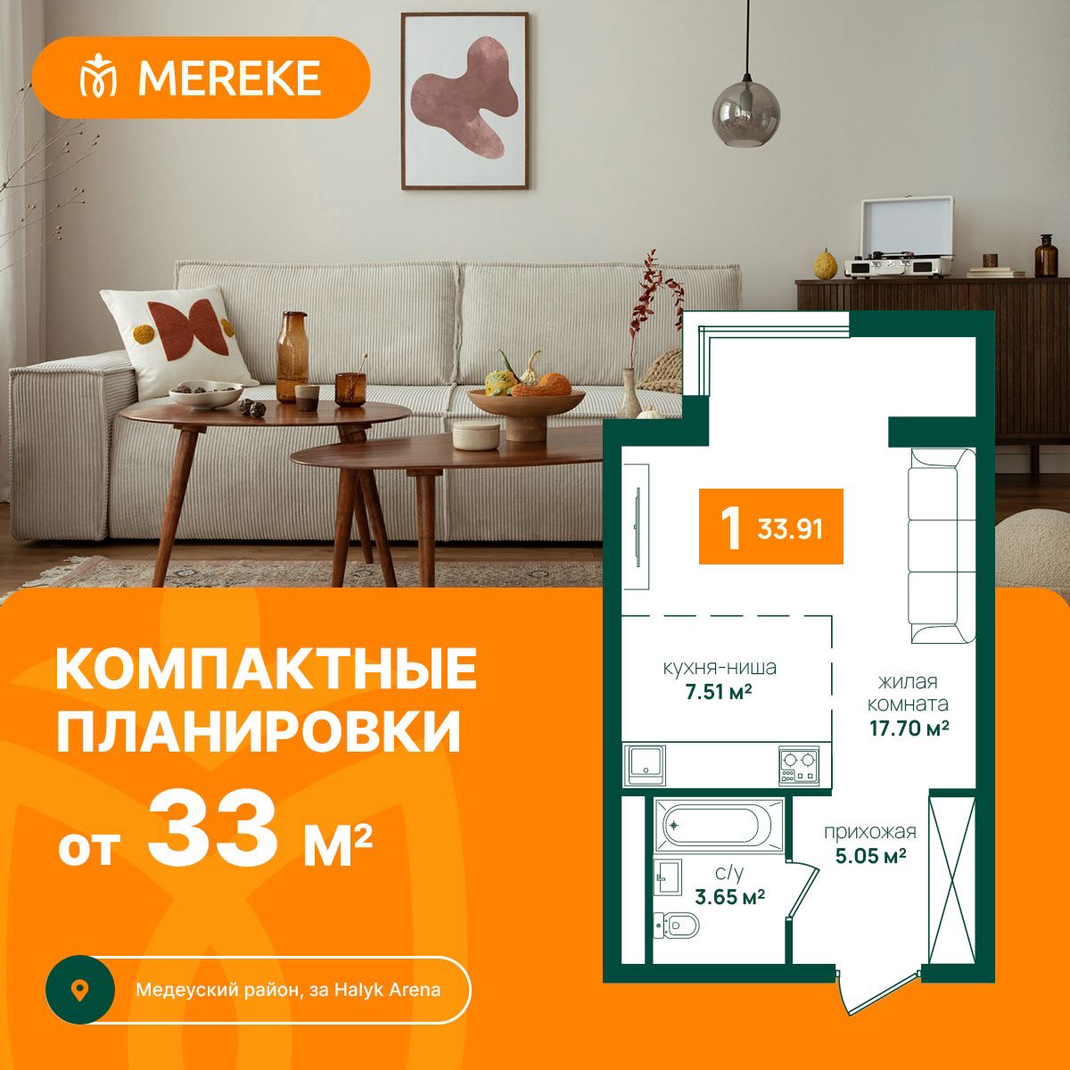
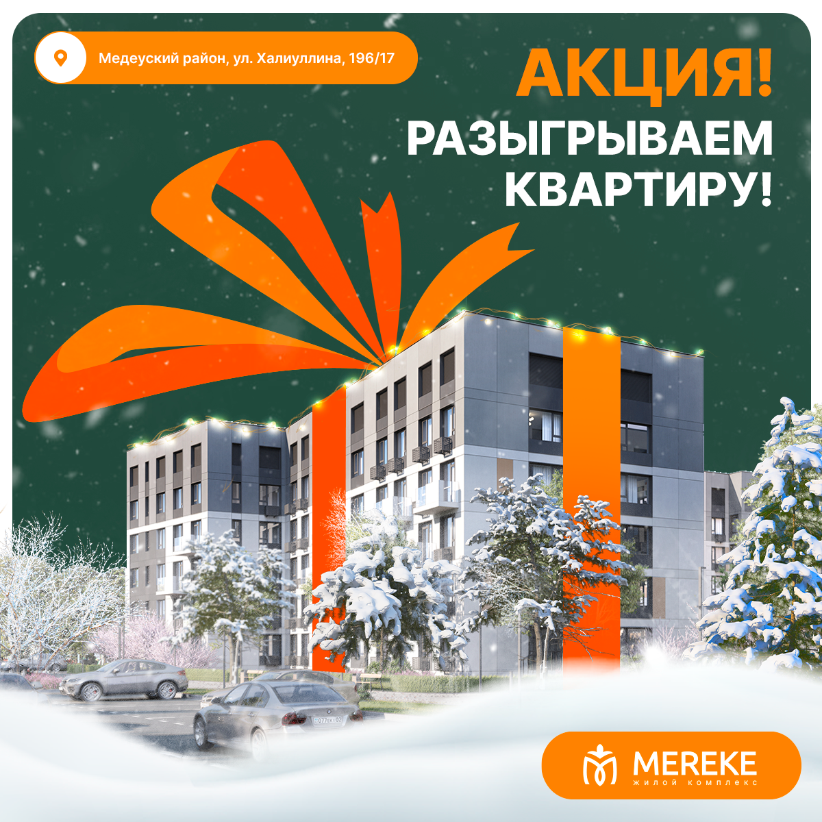
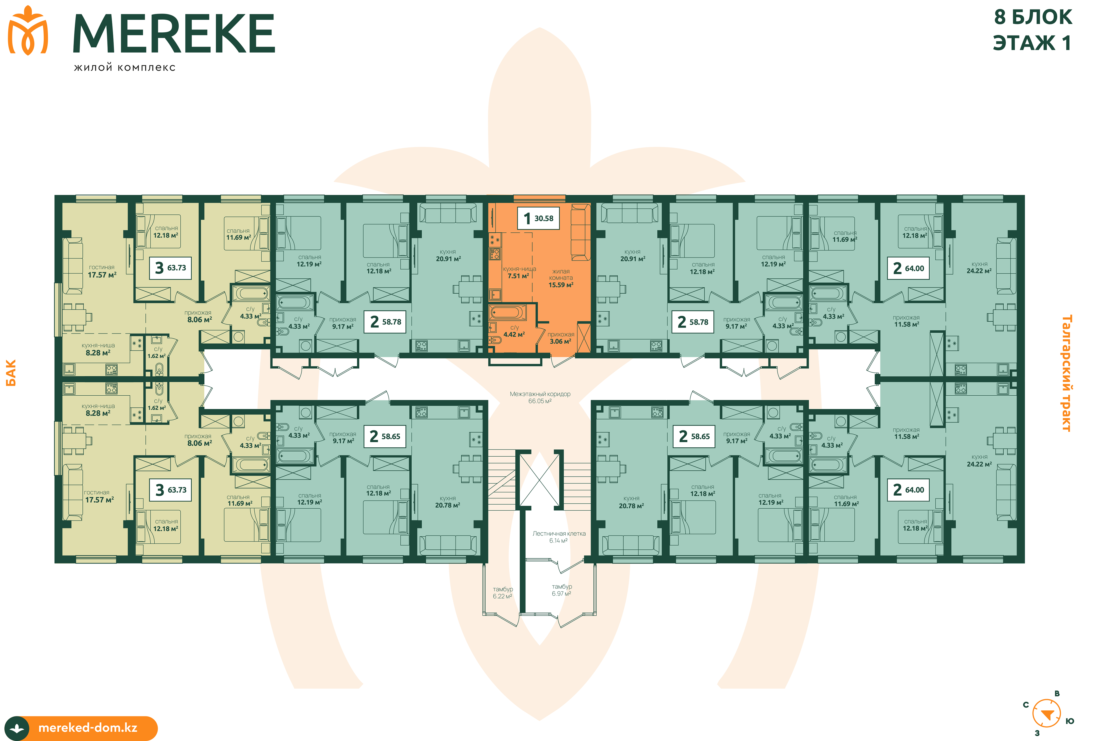
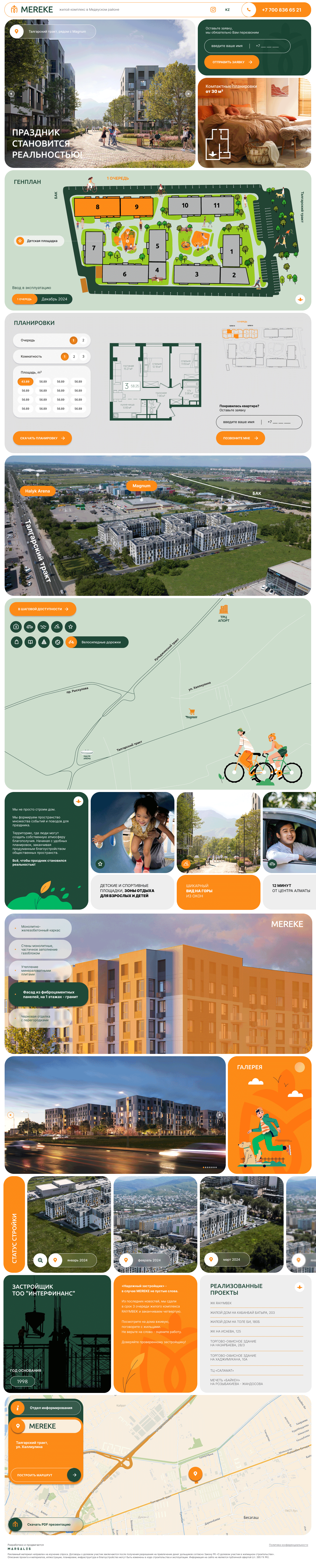
The branding system spans logo, print materials, environmental graphics, and website design, creating a cohesive and lively presence across all touchpoints. The approach balances vibrancy with clarity, ensuring the brand feels approachable while communicating reliability, comfort, and modern urban living.
The final result is energetic, contemporary, and community-oriented, perfectly aligned with the lifestyle and expectations of young adult residents.