UX Design Internship — Media Art Xploration
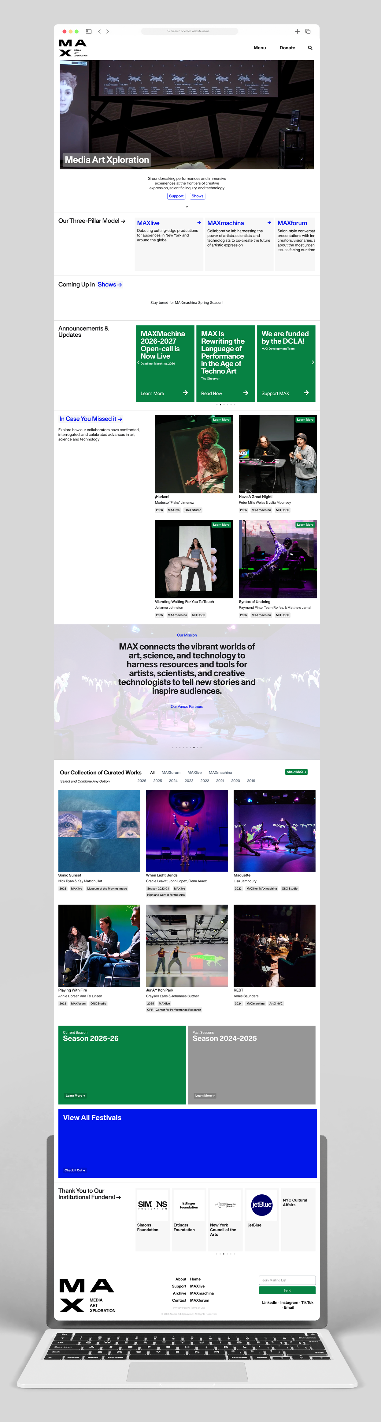
During my internship at Media Art Xploration (MAX), I collaborated with the UX lead and UX designer to develop the next stage of MAX’s web experience — an improved digital platform for donors, artists, and students to access the organization’s productions and resources. MAX produces experimental live-art experiences at the intersection of artistic practice, scientific inquiry, and technology in New York City, making clarity and accessibility central to the redesign.
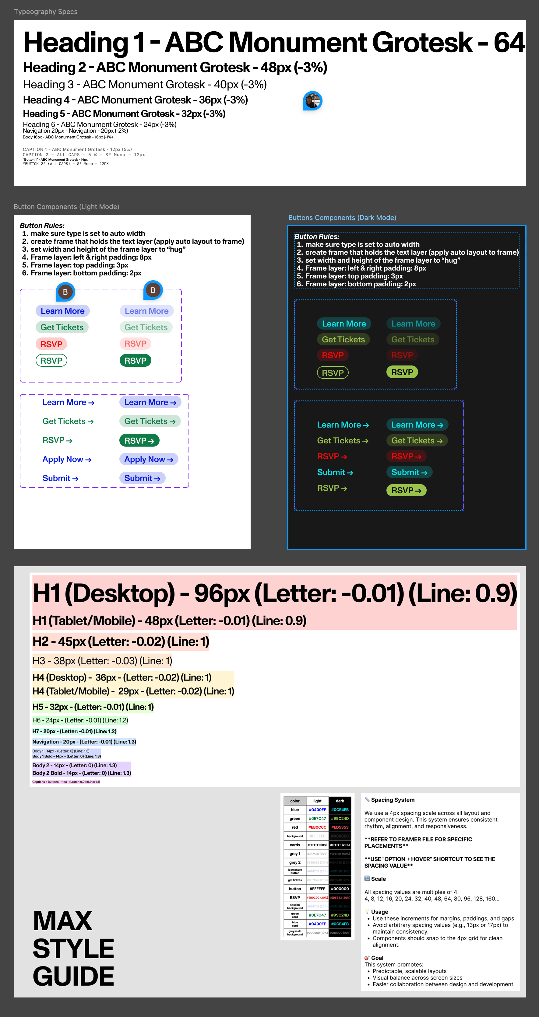
I contributed to research, analysis, and design exploration to help shape a more effective digital platform. This required adapting quickly from strategic thinking to hands-on design collaboration while maintaining alignment with the organization’s broader goals. After completing the first stage of the design, our team moved into the implementation phase, translating the UX concepts into a functional website built in WordPress. I participated in assembling and structuring the site, assisting with both layout implementation and visual refinement. I also worked closely with MAX’s archive materials, helping organize and integrate content so that past productions and resources could be presented clearly and coherently within the new platform.
Research & Discovery
Because the redesign was initiated without a clear understanding of user pain points, our first priority was establishing a strong research foundation. I contributed to:
- Competitive and landscape analysis of design studios, archives, and NYC-based production organizations
- Site audit and evaluation of existing content structures
- Asset organization and documentation
- User flow mapping and early information architecture
Research materials and working documents were organized across Figma, Framer, Notion, and FigJam to support collaborative decision-making.
Key Findings
Strengths of the existing platform
- Strong hero imagery and embedded video that effectively conveyed MAX’s experimental tone
- A distinctive visual aesthetic aligned with the organization’s artistic identity
- An engaging footer structure that offered additional contextual navigation
Areas for improvement
- Inconsistent visual hierarchy across pages
- Disconnected component design
- Confusing navigation pathways
- Poorly grouped content and information overload
- Limited accessibility and scalability for future growth
By grounding the redesign in research and user flows, we began shaping a more coherent digital structure — one that would not only modernize the interface but also better support MAX’s mission of connecting artists, audiences, and supporters through experimental media art.
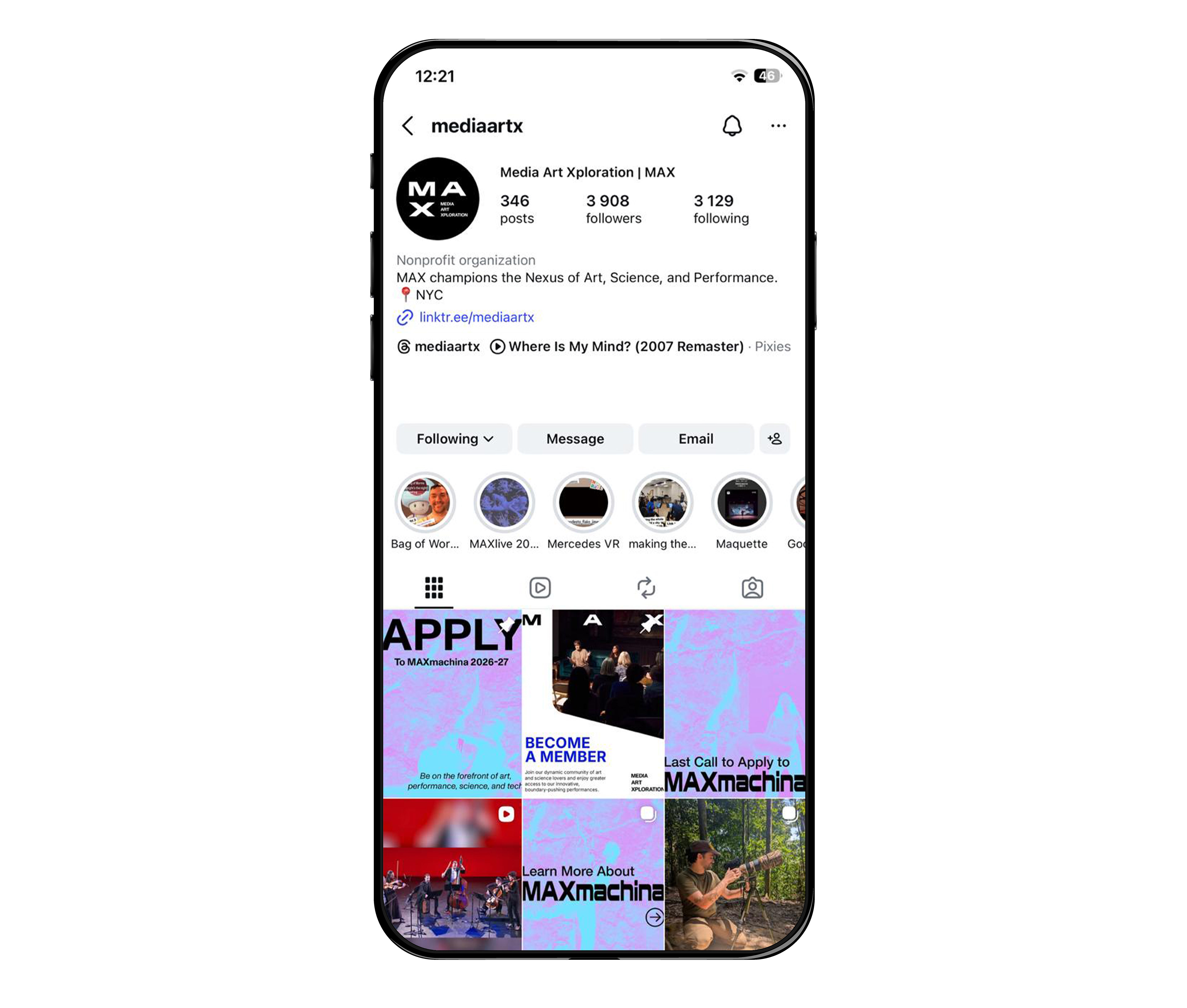
Alongside the website redesign, I contributed to MAX’s social media strategy, focusing on LinkedIn engagement. Through content planning, design of visual assets, and strategic posting, I helped increase both interaction and audience reach, growing the follower count from 2,000 to 3,900 on instagram in just a few months.
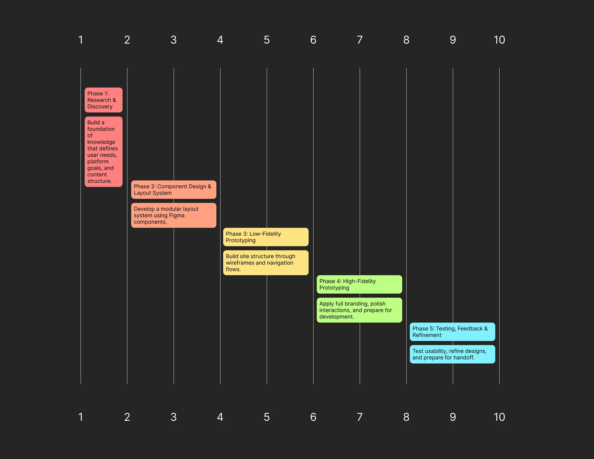
5 Phase, 10 Week Timeline
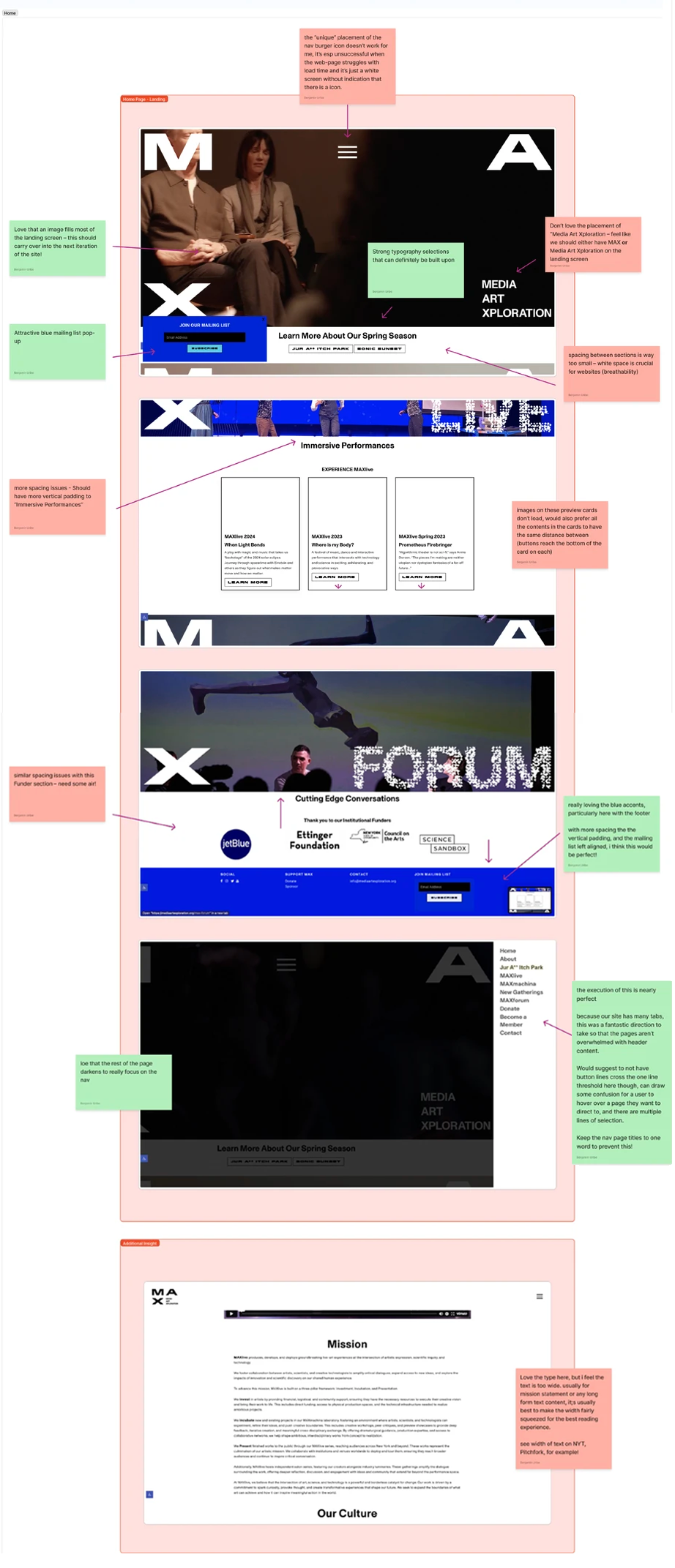
Audit. What works, what doesn't.
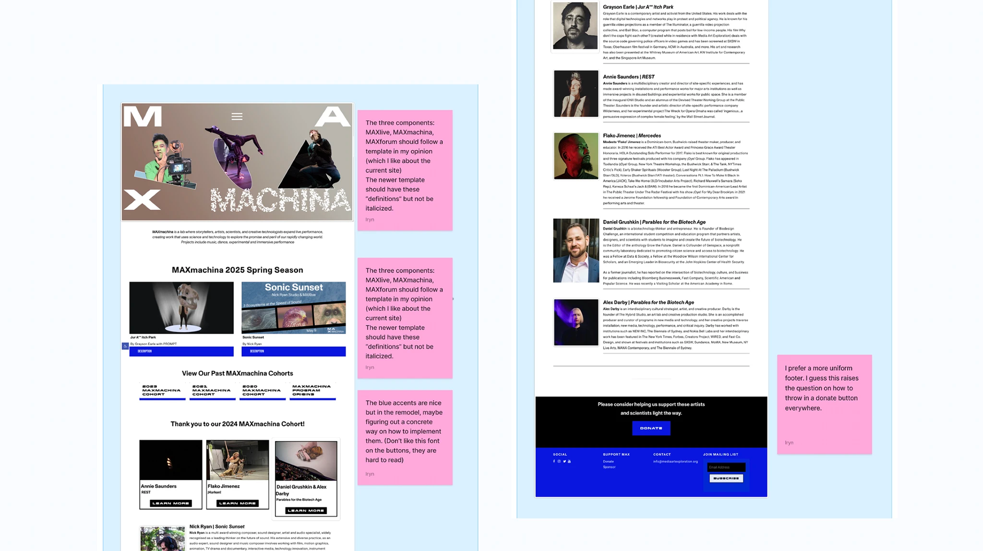
→ Project Pillar Page